Interesting Use of Logos in Web Design

A company’s logo is more than just a basic illustration shared on business cards; it is part of the brand identity that defines the business and helps it to grow. Marketers and graphic designers will certainly have an opinion about investing in logo design. They will echo the sentiment that if a company is serious about branding, it will want to pay close attention to the way the brand is visually conveyed to consumers. The most prominent companies in the world always have a recognizable logo, and when people recognize that image, they spread the brand and contribute to the advertising initiative.
Different Types of Logos
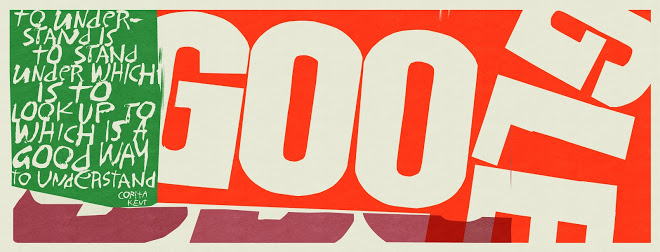
A logo design does not necessarily have to include an elaborate illustration or mascot. Some very famous logos are simply names in a custom font or a simple title font with specific placement and colors. Examples of companies that have simple logos that are mostly text-based are Google and The Home Depot.
On the contrary, some logo designs do include unique illustrations that become a recognized icon for the business or even a recognized symbol for the industry. ATT’s globe-like illustration is often seen instantly with telecommunications, and most car manufacturer logos are recognized immediately by the general public, even by young people who have never driven a car.
Leading with the Logo to Introduce the Website

It is rare that a logo will not be included in the header area of a website. Studies show that a majority of web visitors expect to see a logo in the top left corner of a web page, and their eyes tend to travel from the top left corner and diagonally to the right side of the page. On some occasions, the logo may be placed further to the middle or right side of the page, and sometimes it is even placed underneath the navigation menu. This may vary depending on whether the logo is designed in a more vertical or horizontal fashion. When the logo is missing from this area of the website, a visitor may not immediately identify with the brand and have difficulty connecting with the purpose of the website. Furthermore, it is recommended that the logo also be a link to the homepage of the website.
Using Logo Elements in the Background
When a logo has a unique illustration or shape, it may be used as an interesting watermark style background. Sometimes, just a part of the shapes in the logo may be applied to the background of content, or in the background of a header image.
SEE ALSO: Designing a Great Meetup Page
Using Brand Elements in Other Aspects of the Website

All elements of a logo can be considered aspects of the brand, even the color choices. If the accent color in the logo is a deep purple, that same purple may be a nice accent color for the border of the navigation menu or the heading text in the content. If a special font was used in the logo name, it is a good idea to continue using that same font throughout the website, in page titles and subheadings perhaps. Does the logo also include a slogan or motto as a subtitle? This messaging should be considered for additional content throughout the site. For example, if the slogan has a certain playful tone, that same tone can be used in page titles and introduction text on a few inner pages. In one case, we used some stair-like boxes from the icon in a construction company’s logo as a collage style element beside some introduction text on the homepage of the client’s new web design.
Displaying Logos in Other Fun Ways

Dell Computers was quite good at this idea for a while. In the ’90s, they often printed playful illustrations of their logo in advertisements and magazines to showcase a theme. Perhaps the logo would be featured as a festive holiday arrangement in a holiday banner, or as an iceberg with some penguins floating atop for the winter selling season. As long as the brand is retained and still recognizable, these custom renditions can be a fun way to engage customers. It is important to refer to your brand guidelines (often provided by the logo designer) to ensure that the logo does not lose integrity and disrupt your brand message.
Google is another well-known collaborator on logo tangents that are often animated and even interactive. At one time, the Google logo was displayed on its homepage as a working Pac-Man game coded in HTML5. Although the search engine pioneer has a simple logo comprised of only 6 letters, millions of people around the world are familiar with its brand and signature rainbow color scheme. It often showcases original “Google Doodles” for various milestone dates, to commemorate noteworthy people or events in history.
It can often be fun to share theme ideas on a website, especially tying in with a special offer or holiday. Linking the theme with your logo is a great way to keep the brand fresh and alive.
Posted in: Austin Web Design, Marketing, Web Design, Web Design Resource, WWW Learning Center
One response to “Interesting Use of Logos in Web Design”
Latest & Greatest
- Beyond Pretty Pictures: Why Solid Web Design Matters (More Than You May Think)
- Getting Creative with Your 404 Not Found Page Design
- Web Design Solutions: Which Option Is Right For You?
- Maximize Your Site Redesign Budget: What Texas Web Developers Need From You for a Cost-Effective Collaboration
- Responsive Web Design in Austin: Why It Matters For Your Local Business
- How to Prepare Your Website for a PR Campaign
- Why Defining Your Organization’s Strategy is Key to Brand and Marketing Development


I totally agree wit you that a unique and attractive logo of any brand plays a huge part in its recognition. People memorize logo’ easily, as you mentioned about different car manufacturing companies. Now a days use of logo’s in a web design is a must and a good website development company understands it’s role in a good website.