Identity Legacy

We live in a visual world saturated with symbolism. A walk down the street brings us the sight of billboards, posters, signs in shop windows, and even vinyl graphics on corporate vehicles. This visual saturation, which has changed the experience and process of business, began over sixty years ago, and continues to the present day unabated. The digital revolution has, in fact, only increased the need for businesses to compete in the visual marketplace with the implementation of logos and websites that reinforce brand identity and build client loyalty.
Unfortunately, the interests of designers and business owners sometimes seem at odds. Designers wish to push the visual envelope, creating symbolism that will astound and amaze. Business owners are more concerned with the expense and reward side of the equation: how much will this mark cost me? What rewards will my business reap from it?
In general, the creation of a logo or visual identity mark can be reduced to four considerations which I have simplified into the acronym VICE: Versatility, Interest, Creativity, and Evolution.
Versatility
The process of corporate branding involves the implementation of a visual mark on as much collateral as possible. Letterheads, business cards, envelopes, brochures, and websites should all carry this new corporate identity to reinforce to the audience that each form of collateral belongs to a single strong corporate identity. To this end, the visual mark should be designed to be easily “read” in a variety of sizes, in digital and print format, in color, and in black and white. Larger corporations will often invest in the creation of a “brand manual,” a telephone-book-sized tome that specifically outlines the specifics of font size and weight as well as Pantone colors (for offset printing) and hexadecimal color values (for electronic media). This consideration should be primary in the design of the visual mark.
Interest
The logos we remember most throughout the history of business have all been visual innovations. They become common to us in their familiarity, and yet a careful examination shows that each mark was a noteworthy mountain in the visual landscape of their era. One fine example of this that professors in art schools are fond of using is the logo for Federal Express. I have personally seen this logo thousands of times in my life, and never noticed the shape of an arrow hidden between the “E” and the “x” in “Express.” This shape was deliberately placed by the logo’s designer Lindon Leader in his redesign of the logo in 1994.

Creativity
This consideration derives from interest in a much less technical way. In order for a mark to represent a brand in a unique way, that brand must have a unique message. Even if the brand itself represents a fairly sterile product or service, there must be some vision or concept embodied by that brand to make it compete with other brands in the same market. Finding ways to communicate this vision to the designer may help inspire him or her to create a unique mark; something that communicates at a more elemental level and embodies the spirit of your brand. The most important thing one can learn about creativity is that creative vision is contagious; ideas inspire other ideas, and somewhere along the chain an idea will be inspired that will lead to the creation of a memorable visual identity.
Evolution
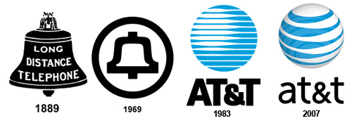
It is important to understand that a successful brand can stand the test of time. While large corporations often invest in campaigns to place their visual identity in new markets, or emphasize different aspects of their brand, the key mark is often immutable. Even when the mark is changed over time, it retains many of the key visual characteristics that originally made it unique.

It is important, however, to be cautious about visual marks based on cultural trends. While some of them can escape the ubiquitous de-popularization of trendy visual media, a company’s entire visual identity can be lost if it associates itself too strongly with cultural references that will soon be forgotten. Remembering to rely on more universal and timeless symbolism can help guarantee that your brand will not only compete in an environment saturated with visual marks and symbols, but also evolve and grow well into the future of your company.
Posted in: Austin Web Design, Marketing, Web Design, WWW Learning Center
Comments are closed.
Latest & Greatest
- Beyond Pretty Pictures: Why Solid Web Design Matters (More Than You May Think)
- Getting Creative with Your 404 Not Found Page Design
- Web Design Solutions: Which Option Is Right For You?
- Maximize Your Site Redesign Budget: What Texas Web Developers Need From You for a Cost-Effective Collaboration
- Responsive Web Design in Austin: Why It Matters For Your Local Business
- How to Prepare Your Website for a PR Campaign
- Why Defining Your Organization’s Strategy is Key to Brand and Marketing Development
