Responsive Web Design in Austin: Why It Matters For Your Local Business

As a local business owner in Austin, are you designing your website for responsiveness? From SEO best practices to user experience, responsive web design significantly impacts all aspects of your site’s performance.
Learn more about site responsiveness and why working with a website design company in Austin can better support your local business needs.
What is Responsive Web Design?
Responsive web design means adapting a website’s layout and design to fit the device it’s being viewed on. This ensures visitors can easily navigate your site on mobile, tablet, and desktop because it adjusts to all screen sizes and orientations. It allows you to maintain one website property that automatically serves people from multiple viewpoints. That way, your business doesn’t have to invest in building separate sites for different devices.
In today’s digital landscape, internet users search and browse for information instantly. If your site makes it harder for them to do so, they’ll quickly leave for a competitor who won’t. Your website must keep up with its responsive design or lose potential customers.
How to Check Your Website for Responsive Design
Unsure if your site has poor responsive design? There are metrics and key website performance indicators to measure its responsiveness. Conduct a site-wide audit and check for the following:
Page Load Speed
As best practice, aim to have your site’s pages load in two seconds for optimal responsiveness and user experience (UX). Luckily, you can learn your site’s page loading speed for free.
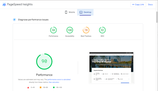
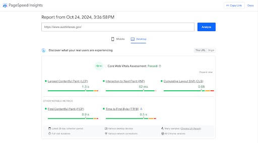
All you have to do is copy/paste your website URL into Google’s PageSpeed Insights. It’ll show your site’s average page load time on desktop and mobile. These results indicate how fast your site loads on all devices, allowing you to see what real users are experiencing.

PageSpeed Insights will also provide you with a free Core Web Vitals Assessment, including diagnosis performance metrics in all areas of your website. It even displays page screenshots, along with your existing back-end code so you know exactly where flagged issues are located and how to correct them.

Bounce Rate
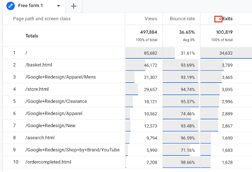
Bounce rate measures how often visitors leave your website after viewing a single page. Understanding this data helps you discover which pages aren’t effectively engaging visitors. If you find a bounce rate above 40%, it might be an indicator that users are having a frustrating experience with your site’s responsiveness.
During your site audit, look at the Google Analytics 4 (GA4) traffic acquisition analytics. The Traffic Acquisition Report displays your website’s total bounce rate and breaks down the average for each page. This allows you to identify which pages aren’t engaging visitors.

Source: Google Analytics Help
Average Session Duration
Average session duration measures how long people browse your site. Knowing how long your user’s browsing sessions are determines how engaging your site is. The more responsive your site design is, the easier it is for users to explore your content, interact with it, and learn more about your brand.
While this metric differs by industry, the typical session benchmark is 54 seconds. You can also find your average session duration in GA4’s Traffic Acquisition report. However, GA4 labels this as “average engagement time per session.”
Crawling and Indexing Issues
Since Google is the internet’s primary search engine, your website must adhere to its algorithms and SEO guidelines, including responsiveness. Google search bots must crawl (discover) and index (store) your website to their database for users to find it when searching with keywords relevant to your business.
If Google can’t effectively crawl and index slow-loading pages or mobile display errors, they may determine your website as unresponsive. As a result, your site may not appear on the search engine results page (SERP), which essentially means it becomes invisible online.

Source: Google Search Central
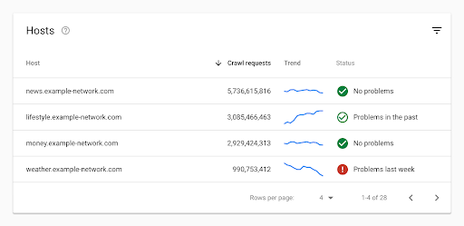
You may already know how to send crawling and indexing requests via Google Search Console. However, you should also monitor the status of these requests in your Crawl Stats report. This report will reveal your website’s crawling history and indicate whether Google experiences issues when attempting to crawl it.
The Crawl Stats report will also show which URLs were unsuccessful and why, such as invalid robots.txt files or unresponsive servers, so you know how to fix them.
Why Responsive Web Design in Austin is Critical for Local Businesses in 2024 and Beyond
Having a responsive website is also imperative for local Austin businesses, specifically. In the city’s bustling marketplace, your site needs to perform as required, or it can become easily lost to the vast competition nearby.
You can (and should) leverage responsive web design in Austin to stand out and strengthen your company’s success.
Strengthens Your Local SEO to Attract Nearby Customers
As a local business, strengthening your site’s online visibility for audiences in your surrounding areas is crucial. It promotes local audience discovery to attract customers who live nearby to your site.
Responsive web design improves your site’s local SEO. Google rewards websites that meet E-E-A-T guidelines by ranking them higher on its search engine results page (SERP). E-E-A-T stands for Experience, Expertise, Authoritativeness, and Trustworthiness. Google recently added “Experience” to its automated ranking systems to better provide helpful, people-first content.
Website responsiveness can boost your site’s SEO performance because you’re providing a better user experience (UX) per Google’s algorithm. Your site can generate more organic traffic because it’s ranking higher for local navigational keywords people use to search for information or products/services related to your business online.
Responsive UX web design should include:
- Increasing page load speeds on all browsers by using CDNs (Content Delivery Network) with caching features and compressing large media files to lower resolutions
- Optimizing your site for mobile devices via flexible web design grids and layouts, like CSS and max-width image source codes, to better adjust to different screen sizes and orientations
- Improving your navigation with site breadcrumbs for users to backtrack easily and de-cluttering your navigation bar design with organized content label categories
SEO-focused responsive websites make it easier for Google to discover and show them to users by making them more adaptable.
Reaches More Local Audiences with ADA Website Compliance
Your website must be accessible to all users, including disabled people. Disabled users navigate websites differently, requiring your site to comply with the best ADA website accessibility practices. Responsive web design provides them an equal opportunity to use your site, regardless of their capabilities, allowing your business to reach more local audiences.
Ways to improve your site’s responsiveness for accessibility include:
- Implementing assistive site technologies, like screen readers for blind users and speech recognition software for people who can’t use a keyboard
- Making your website content easier to read, with scalable images, legible fonts, balanced white space to break up heavy text, contrasting colors, HTTP response headers, and minimizing many UI elements that become distracting
- Optimizing your site for accessibility, with image alt text to describe your visuals for people who can’t see and descriptive links that tell users what they’re clicking into for screen readers
Increases Brand Awareness to Stand Out From Local Competitors
Did you know around three small businesses account for every 100 people in Austin? This same study shows the U.S. has two small businesses per 100 people, showcasing Austin’s above-average entrepreneurial performance.
As a local business owner, you know the competition is fierce due to the city’s booming small business market. And responsive web design in the Austin market can help your brand stand out. Providing them with a better user experience via site responsiveness gives them a better impression of your brand than your competitors.
In 2024, 54% of users won’t recommend a business with a bad mobile website, and 89% will shop with a competitor due to poor UX. Don’t be the reason they leave.
Streamlines the Customer Journey for More Conversions
While responsive web design may seem user-focused, it also benefits your local business by boosting conversions. Companies that invest in website responsiveness achieve 11% more conversion rates.
You’re streamlining their purchasing process with faster page load speeds, seamless navigation, mobile-optimized design, and more. It allows people to buy from you more easily from any device, anytime, anywhere.
Improves Your Site’s Performance Metrics
Your website is a significant investment. From web developers to SEO copywriters and graphic designers, your business spends ongoing time and resources to run it efficiently. Responsive web design can improve your site’s metrics all around for a greater ROI.
Faster page loading speeds contribute to reduced bounce rates and increased average sessions, so fewer people leave, engage more, and buy from you easier. A responsive website is also better optimized for search engines, which can generate more organic traffic from increased keyword rankings and online visibility.
Supports Your Bottom Line With a Better-Performing Website
Your website is the foundation of your local business marketing. Its performance significantly contributes to the success of your company. When your website functions as it should, it provides a strong digital customer experience to better support your bottom line. It acts as your elevator pitch, which can be the first or last interaction they have with your brand.
While responsive web design is about your users, it should be about your business, too. Leave them with a lasting impression they won’t forget by adapting to their needs while aligning them with your goals.
Web Designers in Austin Help You Reach More Local Customers with Responsive-First Site Design
Responsive web design is an ongoing requirement. As an Austin business owner, it can be challenging to navigate various site design technicalities, like coding, testing, and SEO optimization—especially in a major U.S. metro. You not only have to manage your business but also be an expert in your trade.
Let us help you with the workload.
At WEBii, our web designers in Austin have the specialized expertise to make your local business stand out online in a dense market. As an Austin web agency since 1996, we offer quality end-to-end website services from design to custom development and content marketing.
Ready to make your site more responsive and reach more local customers?
Learn more about our web design and development services, or contact us for help today!
Posted in: Austin Web Design
Comments are closed.
Latest & Greatest
- Maximize Your Site Redesign Budget: What Texas Web Developers Need From You for a Cost-Effective Collaboration
- Responsive Web Design in Austin: Why It Matters For Your Local Business
- How to Prepare Your Website for a PR Campaign
- Why Defining Your Organization’s Strategy is Key to Brand and Marketing Development
- Empathetic Storytelling in an AI World
- Customer Retention: A Comprehensive Guide to Retaining Your Customers
- Top Reasons Why Web Designs Don’t Launch
