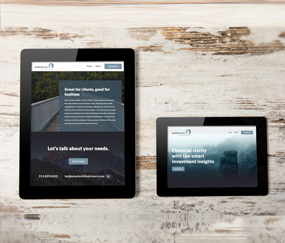
The Components of a Well-Designed One-Page Site

One-page websites have been trending for several years now. The appeal is obvious: simplicity. Well-designed one-page sites offer a clear and fast reading experience, mobile-friendliness, and intuitive scrolling. In a world where people are constantly being bombarded by content, users are drawn to the sleek design of one-page websites, making this design choice a good one for many applications. However, a one-page site isn’t for everyone; they work best for online portfolios, small business websites that sell only a few products/services, or a campaign-specific landing page. If your website is complicated, content-heavy, or contains a lot of information, a one-page site may not be the right choice. If you think this website style does fit your needs, though, then keep reading as we explore the components of a perfect one-page site.
Keep It Simple
In the case of a one-page site, less is more. Before you begin designing your website, consider the main message that you want to get across. It is also important that your content is short and sweet and that your text is easy to read. When visitors come to your site, they tend to look for essential information right off the bat. Make this easy for them by presenting your content in a way that is in line with how users read and process information. It is also crucial that you get rid of any extraneous information that could potentially bury the vital info.
Go for a Logical Layout
We live in a society that demands instant gratification. To make the user experience of your site more effortless, you should plan how you wish to structure your content. Make each piece of content stand out by using separate defined sections so that your visitors can find what they need more easily. In addition, it might serve you well to utilize big header elements. These are a mainstay of most website designs nowadays, but they’re especially crucial on one-page sites since they help capture users’ attention. Below are more options for dividing up the sections of your website:
- Choose a different background color for each section.
- Use horizontal lines and spacing to separate sections.
- Add a photo or slideshow to break up the text.
- Use the columns element to break up large blocks of text.
Enrich Your Text with Visual Content
Humans are extremely visual creatures, with 65 percent of them being visual learners. This means that one of the best ways to get your story across is through visual content. You can have some of the most innovative, brilliant text on your site, but if you don’t break it up with multimedia, readers will naturally become uninterested. Adding videos, photos, and slideshows can help to captivate users in a way that written text simply cannot.
Make Navigation Easy
Despite a one-page site seeming easy to navigate (all you have to do is scroll, right?), there are some navigation features that you should still employ to make your website more user-friendly. Navigation essentially guides visitors to where they can find specific information about your company’s offerings. On a one-page site, however, you won’t be taken to another page through the navigation like you would be on a traditional website. Instead, you can set your navigation to jump to various points on the same page by utilizing anchor links. It is extremely important that you keep your navigation simple. For example, do not use links to external websites on your one-page site, as it can confuse users. Instead, link external sites through icons to make where visitors are being redirected clearer.
Have Strong Calls to Action
Designing your homepage with strong calls to action is a must, and one-page sites are no different. If you have ever downloaded iTunes or Dropbox or even signed up for a newsletter, you likely know that these “sign-ups” were a product of an enticing call to action. When creating your one-page site, consider what you want your reader to do and how you can prompt them to do so with a strong call to action.
Even with a one-page web design, bringing your dream site to life can be more challenging than you might think. If you find yourself in this position, it might be time to call in the experts. Hiring a team of professional and experienced web developers and designers can make a world of difference when it comes to making that great first impression with your visitors.
Posted in: Austin Web Design, Web Design, Web Development, Website Usability, WWW Learning Center
Comments are closed.
Latest & Greatest
- Maximize Your Site Redesign Budget: What Texas Web Developers Need From You for a Cost-Effective Collaboration
- Responsive Web Design in Austin: Why It Matters For Your Local Business
- How to Prepare Your Website for a PR Campaign
- Why Defining Your Organization’s Strategy is Key to Brand and Marketing Development
- Empathetic Storytelling in an AI World
- Customer Retention: A Comprehensive Guide to Retaining Your Customers
- Top Reasons Why Web Designs Don’t Launch
