Above-the-Fold: How an Austin Web Design Company Improves User Engagement

Your site is finally taking off and getting a decent amount of online traffic – hooray! Now that you have people visiting your website, it becomes increasingly important to focus on user engagement.
That’s right: getting users to your website is only half the battle. To keep your visitors engaged and roaming around within your site, it is vital that you have well-designed “above-the-fold” content. First impressions are everything, so having an eye-catching design is more than just a matter of aesthetics; it can make or break your conversion goals. Remember, every click and scroll counts!
If you are a business targeting Austin-area customers, sometimes it is necessary to enlist the help of a well-established Austin web design company to get the job done.
What is above-the-fold content?
Content that is above the fold is the first thing that your site visitors see on your website without having to scroll. The term “above-the-fold” was originally associated with newspapers. Newsstands only display the uppermost headlines and images, making it extremely important to catch the reader’s eye with just those few elements. Despite the fact that there is not a literal fold on your desktop or mobile phone, the same principle applies to websites. The end of the browser window is essentially the same as the actual fold in a newspaper.
When you plan your web design, you should consider what kind of messages, links, and visuals are the most likely to appear in this area and how that will affect the engagement of your website.
If nothing in the first section of your web page is interesting to the audience, they are less likely to continue browsing the site.

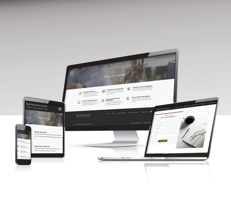
This website example demonstrates well-considered content placement. The responsive design of this website prioritizes a bold image to represent the industry and the list of core services, or a contact form. The experience properly adjusts for each device.
The way your visitors view your website matters.
Sometimes crafting effective above-the-fold content can be challenging. After all, there are so many different devices, screen sizes, and browsers to account for. The experience of mobile users will be different than desktop users.
Depending on the device (mobile phone, desktop computer, tablet, etc.) your site visitors are using to look at your content, the fold line can vary greatly. You should take this into consideration when designing your site’s above-the-fold content, especially making sure that your design is consistent and makes sense for the device. For example, bigger, more legible text and a more navigable menu would be appropriate for mobile versions of your site.
If the task of optimizing your site for multiple devices eludes you, consider outsourcing the job to a web design professional that specializes in mobile-friendly web design. These professionals can help you to better integrate your website’s content into a more digestible format for your visitors across all viewing platforms.

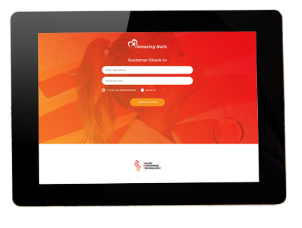
This website application was designed with a form in full view without scrolling since this is the most important engagement required from the user.
Here are some tips for creating effective above-the-fold content.
While there is no specific formula for effective “above the fold” content, there are some best practices that are worth mentioning. Below are a few tips on how to improve your website’s above-the-fold content.
- Be consistent with what you plan on delivering. When someone is visiting your site from an advertisement, link, or email, make sure your above-the-fold content sets the tone for what you are going to deliver. For example, if your ad talks about a “2020 Holiday Gift Guide,” then it would serve you well to ensure that your page highlights that gift guide from the get-go. The last thing your visitors want is to click a link that takes them somewhere that they have to dig for the content they were originally searching for. It’s difficult enough to gain clicks from ads, so it would be a shame to disappoint those visitors who do click through and lose the conversion!
- Only put your best content above the fold. Sometimes it can be tempting to try to cram all of your site’s content above the fold, but this can appear cluttered and overwhelming to your visitors (and it’s basically impossible). Taking a minimalist approach is key, as you do not want to detract from the message or call to action itself by over-designing your above-the-fold content. A clear image and some clever text are all you need to encourage users to scroll down and further explore your website.
- The scroll is your goal. Often, people need to be told what to do next. You need your visitors to scroll and continue engaging with your site, so tell them that. You can guide their next move by indicating that there is more content than what is above the fold through visual cues (like a downward arrow) or clear, concise copy (such as: “Continue reading”).

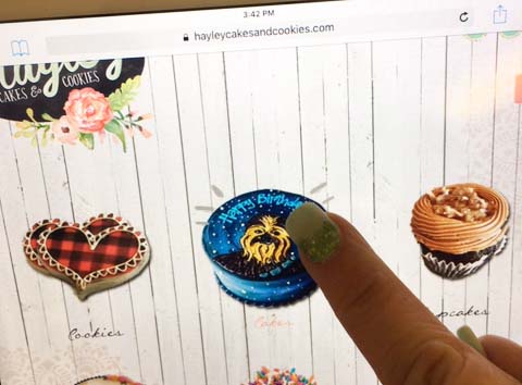
In this example of a web design, the priority is to sell products. The shopping categories are made front and center with colorful icons.
Between paring down your above-the-fold content and implementing a clear call to action to keep your site visitors scrolling, designing your website to be an effective marketing tool can become quite a beast to take on. Letting an experienced marketing consultant and web design firm do the legwork for you can help free up some time for you to spend focusing solely on running your business.
Failing to create good web design is a surprisingly common reason for lack of user engagement. Do not let poorly-curated above-the-fold content be the culprit of low website interaction. Instead, be sure to evaluate your site’s design on different types of devices and keep in mind the best practices associated with creating effective web content.
Posted in: Austin Web Design, Content Marketing, Web Design Resource, Web Site Maintenance, Website Usability, WWW Learning Center
Comments are closed.
Latest & Greatest
- Beyond Pretty Pictures: Why Solid Web Design Matters (More Than You May Think)
- Getting Creative with Your 404 Not Found Page Design
- Web Design Solutions: Which Option Is Right For You?
- Maximize Your Site Redesign Budget: What Texas Web Developers Need From You for a Cost-Effective Collaboration
- Responsive Web Design in Austin: Why It Matters For Your Local Business
- How to Prepare Your Website for a PR Campaign
- Why Defining Your Organization’s Strategy is Key to Brand and Marketing Development
