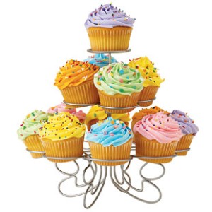
Keeping and Eating Your E-Cake

Sometimes I hear someone hesitate to recommend any “wow” factors for their web design because they are concerned it will mean the website is not viewable on an iPad. And some merchants delay and delay adding a shopping cart (e-commerce) because they think it means the website will become a cold sales-only portal with none of their small business persona left.
After 15 years of working with websites for a variety of businesses – both business to consumer and business to business – I know there is a middle ground. Here are a few reasons why.
1. Modern technologies allow us to have fancy photo galleries and slideshows without Flash.
This means that you can have very visual portfolio elements on your site and remain compatible with iPad, iPhone, and other devices.
2. Audiences have expanded their access to technology.
This is a good thing because we know more about their behavior and what they pay attention to, and we no longer have to design a web page to be for only the teeniest tiniest screen (not always).
3. Your homepage can tease the important elements without overselling.
Your homepage should usually represent a summary of the rest of your website and your goals. You can include calls-to-action (including links to buy an item) without making that front page “just for e-commerce”. You can include highlights about company news, key employees, customer testimonials, and featured imagery. It is very possible to include all of these things with balance and without overcrowding.
4. You can say a little to get a lot.
A strong call to action does not need to be a paragraph. It can be a nice to-the-point statement, a link or button, a bold graphic.
5. Sometimes brief is best.
Your audience will make an impact on what works best for your website, but sometimes a very simple and clean layout with minimal information and graphics can turn out to be the nicest look and feel, yet still sell your product or service efficiently. (This should not be confused with “Door” pages – this is what I call a page that does nothing but shows a big graphic and a “click to enter” link. The graphic or animation you see there might look pretty, but it is an old ’90s way of designing web pages that are now known to be SEO-unfriendly.) So I usually encourage website owners to include some sort of useful content on the homepage.
Posted in: Austin Web Design, WWW Learning Center
One response to “Keeping and Eating Your E-Cake”
Latest & Greatest
- Maximize Your Site Redesign Budget: What Texas Web Developers Need From You for a Cost-Effective Collaboration
- Responsive Web Design in Austin: Why It Matters For Your Local Business
- How to Prepare Your Website for a PR Campaign
- Why Defining Your Organization’s Strategy is Key to Brand and Marketing Development
- Empathetic Storytelling in an AI World
- Customer Retention: A Comprehensive Guide to Retaining Your Customers
- Top Reasons Why Web Designs Don’t Launch

Selling is more productive if the company have accurate prospect information.