What Size Should My Web Page Be?

Have you noticed a shift in the size of web page designs in recent years? As large-screen monitors become more affordable and more popular, many websites have taken advantage of wider page layouts.
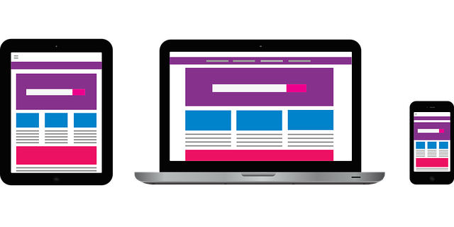
But remember, there are also increased numbers of people using PDAs, iPads, and small laptops to browse the Internet. So if you aim too large with your web design, chances are this audience will need to scroll and scroll.
My recommendation, as with most marketing, is to think about your typical audience first. Is your average customer using a laptop on the road? Or is your average customer in a large office with a network of wide-screen monitors?
Lately, we have been designing web pages with 900px or higher width, but sometimes we aim for a slightly smaller width and use vibrant background patterns to “fill in” the margins as someone with a larger screen expands the browser. This is a nice compromise for those two audiences.
Here is an example of one website that does this well. Try stretching out the page to see how some of the homepage content expands and reveals more imagery.
Posted in: Austin Web Design, WWW Learning Center
Comments are closed.
Latest & Greatest
- Maximize Your Site Redesign Budget: What Texas Web Developers Need From You for a Cost-Effective Collaboration
- Responsive Web Design in Austin: Why It Matters For Your Local Business
- How to Prepare Your Website for a PR Campaign
- Why Defining Your Organization’s Strategy is Key to Brand and Marketing Development
- Empathetic Storytelling in an AI World
- Customer Retention: A Comprehensive Guide to Retaining Your Customers
- Top Reasons Why Web Designs Don’t Launch
