Navigation Design
Tips On Creating Effective Navigation For Your Web Site
This is a legacy article. For more recent information relevant to today’s fast changing online world, visit our blog.
If this is your first experience with designing a web site, you might be overwhelmed with the possibilities. Creating a site that is effective for your business can entail a lot of planning, and sometimes you just can’t figure out where to begin. This article addresses one of the key factors of your web site’s structure: the navigation.
Designing for the Visitor
Although the Internet is growing in popularity, it is important to remember that web site visitors are humans, many of whom are still novices. Maintaining ease-of-use eliminates a visitor’s potential frustration which might cause them to abruptly leave the site.
When planning the content of your web site, try to periodically step back and view the web site as a visitor. What pages would be of most interest to your customers? What information is the most significant? Does the home page content provide a clear understanding of what the web site is about? Does it entice you to continue browsing the web site? What incentives are presented to the visitor that encourage them to continue reading? Can the visitor quickly contact you if a question arises?
Prioritizing Content
Determine a priority level for each page you design. The highest priority information should be accessible in the fewest steps. Links to this information should be easily located. Try to prevent the frustration of fumbling through various pages to find a popular piece of information.
For example: If your healthy lifestyle web site’s most significant page features a book about heart disease, you will want your visitors to access this information in 2 or less steps. The first step is a visit to your web site’s homepage, and the second step is clicking the “Heart Disease” link at the top of that page.
When assigning first level priority to a page, ask yourself these questions:
- What is the purpose of this page (to inform, to sell, to summarize, to entice, etc.)?
- How does this page promote navigation to other pages? Does the information on the page encourage the visitor to interact? Does the reader finish the page and go on to read more? Does the reader finish the article and leave the web site?
- How does the page benefit your business?
And while you do want to focus on creating unique pages that are useful to your visitors, you should also learn from others in your industry who are already successful on the Web. Compare the content of your popular competitors or other established web sites to get a feel for what consumer expect to see.
Pages with second or third level priorities should not necessarily be hidden within the deep maze of your content. If a page is directly related to another article, include links to those articles on each of the sister pages. This allows the visitor to find the related information easily.
Increasing Visibility
As mentioned above, the most priority links should remain highly visible in your web site. The most popular positions for web site navigation buttons is at the very top area of the layout, and at the left-hand side of the layout. This is primarily because of the majority public’s reading format of left to right and top to bottom.
Another reason behind this positioning is because of the functionality of a browser window. Browsers typically scroll from top to bottom and left to right. The first piece of a web site that is viewable to a visitor is the top left portion of the layout. Also, the viewable portion of a browser window is limited to the screen size and computer settings of the user. While the content of each page might expand slightly beyond the default browser window size, it is recommended to keep your navigation buttons or links closer to the top, left-hand corner of the page. This principle helps visitors locate each link without extensive scrolling. If they are able to see the options they have immediately, they may be more enticed to select them.
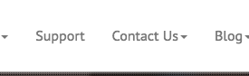
As you can see from this example image, the main navigation options were narrowed down to four key areas of the web site. The graphics for these links are arranged at the top of the page, just to the right of the company logo. If the visitor need assistance with a question or a purchase, the “Contact” link is immediately available.
The links that have been determined as your ultimate priorities can be enhanced to encourage the visitor’s attention:
- Place highest priority links before all other links in the navigation options.
- Emphasize these buttons or links with a bold color or font.
- Repeat the most beneficial links in various areas on the page.
For example: The “Buy Now” button that leads to your order form is the most important feature on your web site. Therefore, you create this button is a bold red type on a yellow background, which contrasts the other buttons on your page using a black font on a white background. The button is placed on the very top, while each other option follows below. A copy of this button is also included on the bottom of the page, below the paragraph that describes your product.
These tips will help you to create a navigation arrangement that is efficient, however you will ultimately know what organization is best for your web site based on the overall design them and your particular web site goals. Don’t forget to be creative, search the Web for ideas that appeal to you, and discover what works for you by trying out various schemes.