The Evolution of Driving Schools From Classroom Instruction to Mobile-First E-Learning Apps
by Jacqueline Sinex
Tuesday, May 19th, 2026
After years of supporting driving schools with their web presence, we reflect on the evolution that these businesses have experienced from brick and mortar classes to e-learning through mobile web applications.

How to Write Website Copy That Helps You Rank on Google
by Aimee Johnson
Thursday, April 9th, 2026
If your copy doesn't actually answer the questions your customers are asking, Google won't rank it, and your visitors won't trust it. Let's break down what SEO-friendly copy actually looks like and how you can write content that finally gets you noticed.

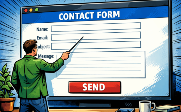
Different Ways to Insert a Contact Form on Your Website
by Aimee Johnson
Friday, February 27th, 2026
From form-builder plugins to CRM integrations, there are many different ways to insert a contact form to a website.
From Contact Forms to Conversational AI: The Evolution of Website Communication
by Aimee Johnson
Monday, February 23rd, 2026
Today more and more websites are closing the gap with the use of modern website communication tools. These tools no longer involve simply sending an email to the address listed on a business’ website or messaging an unattended chat only to hear back days later. They are dynamic, intelligent, rapid response tools that meet a customer’s desire for an i

How Many Plugins Should a WordPress Site Have?
by Jacqueline Sinex
Tuesday, January 20th, 2026
With additional software plugins, you can extend WordPress with even more features. But many marketers wonder, “How many plugins should you install?”

How to Prepare Your Website Content
by Aimee Johnson
Monday, November 10th, 2025
The better prepared your content is for your web developer, the faster your project will progress. But you may be wondering exactly what preparation means when it comes to content and images.

Latest & Greatest
- The Evolution of Driving Schools From Classroom Instruction to Mobile-First E-Learning Apps
- How to Write Website Copy That Helps You Rank on Google
- Different Ways to Insert a Contact Form on Your Website
- From Contact Forms to Conversational AI: The Evolution of Website Communication
- How Many Plugins Should a WordPress Site Have?
- How to Prepare Your Website Content
- How to Fix Common Website Bugs